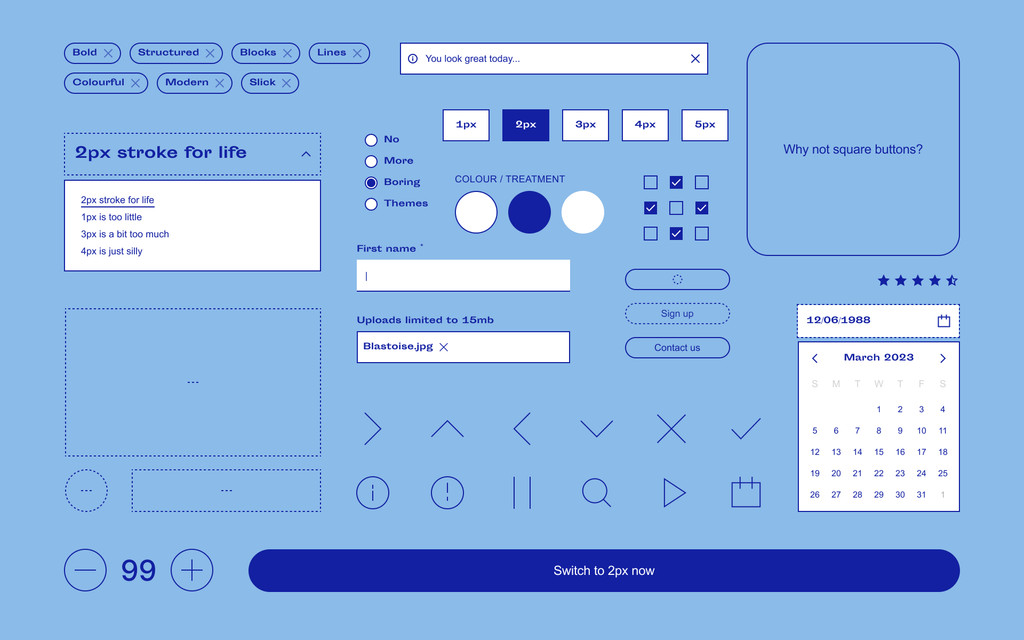
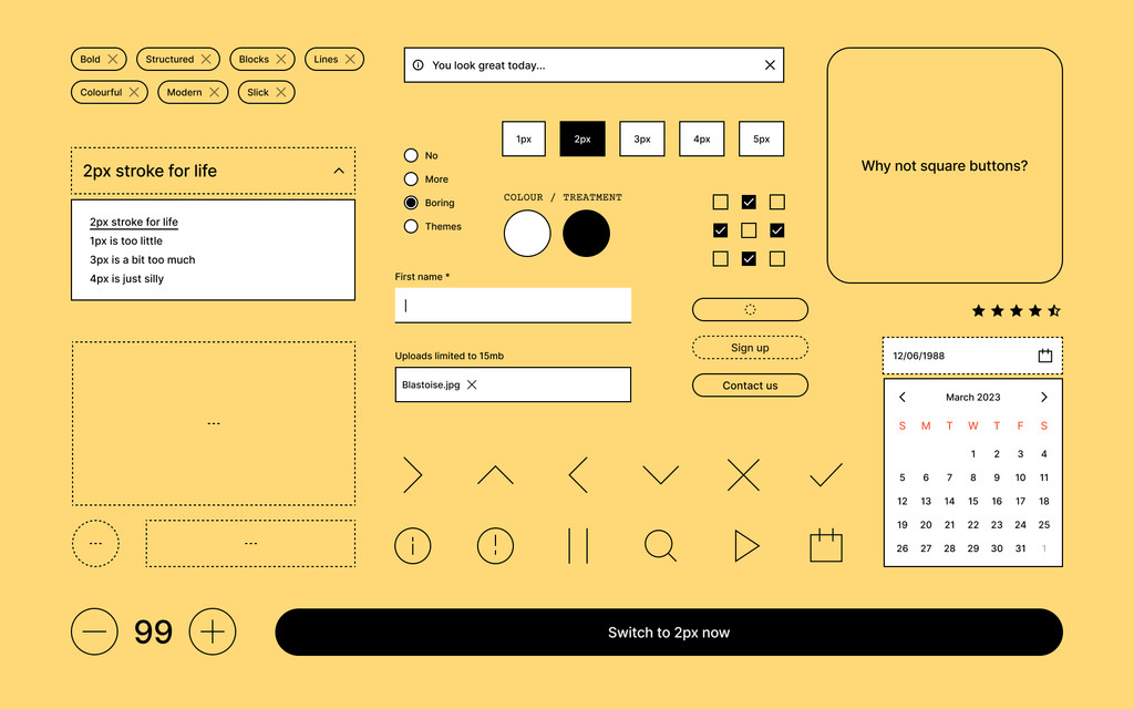
A bold design system and two mockup sites for Vibes, a React component library for composable websites.
The system is called 2px and makes use of a 2px stroke throughout. It also adheres to some basic rules——tight spacing, free/system fonts, contrasty type scaling, and a boxy layout. When used with a sense of humour the system can create some delightful layouts.
The kit offers two themes and can be switched in a flash without having to worry about your components breaking. So if you're running a web store for your fancy furniture gallery and decide to pivot to pokemon card trading, you totally can!
This design is a response to the hyper-polished UI kits and commerce themes out there.
Done during my time at Tinloof.

